Young Lions 2026 - Bronze
Jane Goodall - Hike For Hope
Context
The Jane Goodall Institute Canada is launching Hike For Hope, a weekend-long hike across Canada to fundraise and raise awareness for animals, people, and the environment. Following Jane Goodall's passing, the institute channeled the wave of devotion for her work into its boldest initiative yet, turning her legacy into collective action.
Challenge
In a saturated charity landscape, Hike For Hope needed a bold visual identity compelling enough to inspire companies to build teams, fundraise, and show up for nature.
Goal
Create a cohesive brand system that transforms corporate participation into a visible, engaging, and collective movement
Concept "Walk as One"
Jane Goodall was the first dot on the map. One woman, one belief, one lifetime of showing up for nature. Walk as One reflects her core conviction: that together, we can and we will. Each participant becomes a living dot in a dynamic system, small like a seed, but part of something far greater. The flower is our graphic symbol of hope that every hiker will carry along the hike.
Execution
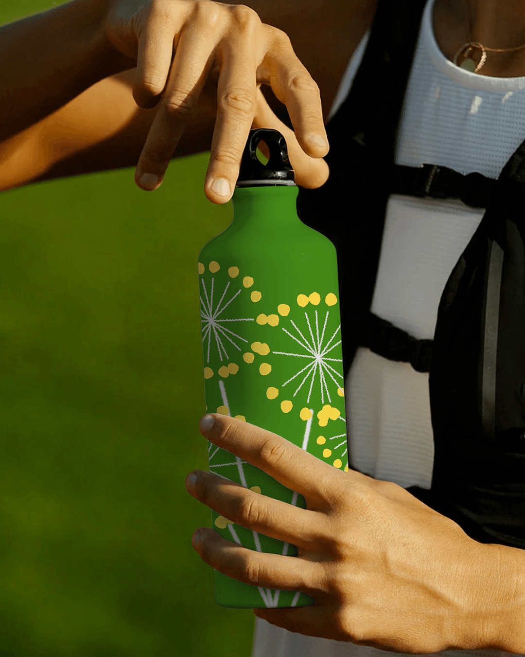
The organic graphic system draws from the shape of a flower to represent connectivity, growth, and collective progress. Each region of Canada has its own color, and each dot scales with distance covered, all connected at the center, forming a living map of impact. The identity was deployed across a website, mobile experience, social media, and a participant kit including a branded water bottle and a region specific flower seed bag. Bold, impactful typography channels the spirit of Jane herself.
Partnership
Léo Maubert & Sam Perrin